Through borrowed laptops, digging a thumb drive out of the bottom of a coffee cup, and disregarding my company’s insatiable desire for keeping pageviews in-house, I have used Tableau at work.
Here is the first Tableau data vis I made for ADVaristySports.com. A graph showing the number of wins for local basketball teams in comparison to the number of games played:
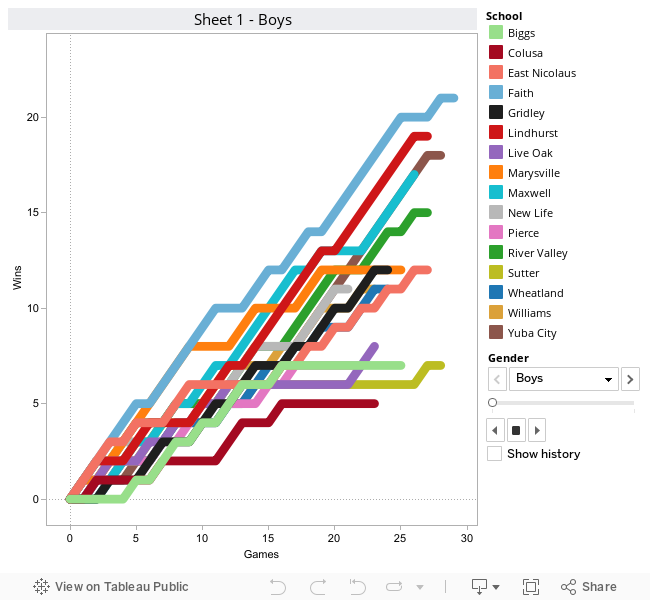
It’s Tableau, so of course, it’s fully interactive. Click on a line in the graph or on a school name there on the right, and everything else is grayed out to highlight that one particular team. You can also flip back and forth between separate charts for boys and girls teams.
The use of this is to give a visual demonstration of when the teams we cover had hot streaks, cold streaks, etc. Of course, the higher up the line goes on the graph, the more wins the team had. If the graph is just moving parallel, that indicates a string of losses.
In a couple of days, I’ll be writing a post detailing the bit of MacGyver journalism it took to get this going. Not too much, but some.